菜单
包装设计|德国 Design Studio B.O.B.下篇
发布时间:2022-10-09摘要:设计作品欣赏
Studio B.O.B.
BerlinOberBilk is a Studio for Design
Branding and Photography,
founded by
Lilly Friedeberg, Alessia Sistori and Marc Oortman.
I am passionate about challenging myself to be better everyday and with every design I do, to be responsible with people and with nature and to find the best solution for every single question.
设计作品欣赏
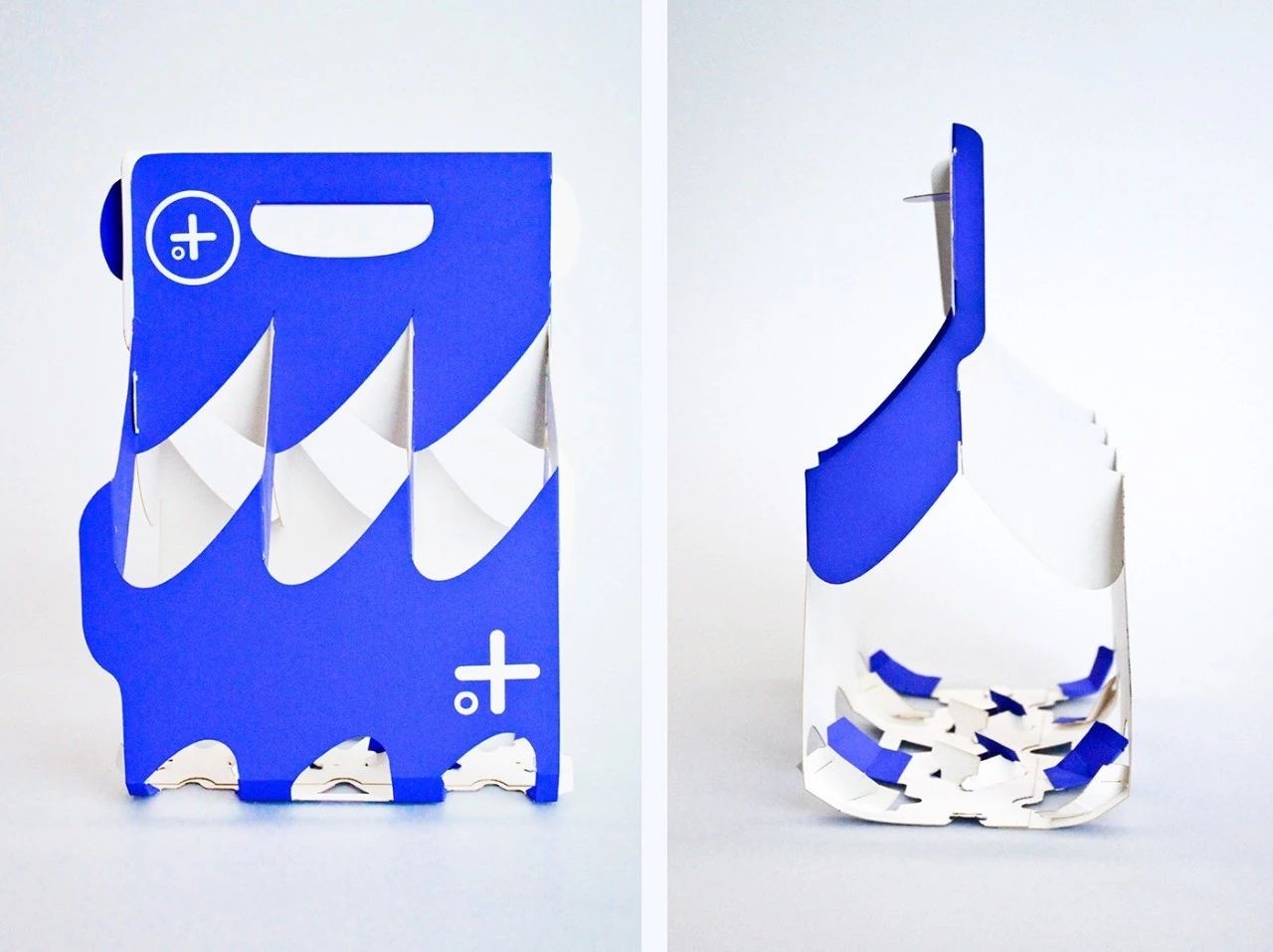
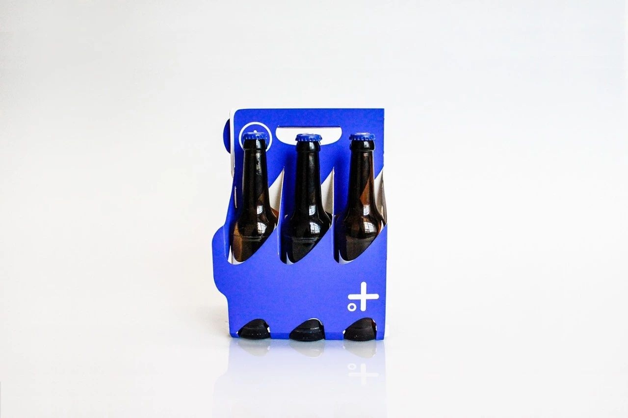
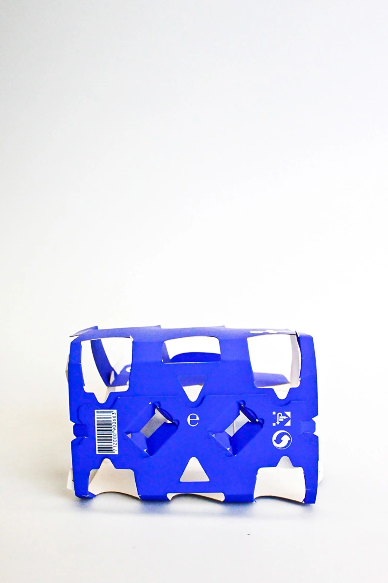
meerbier

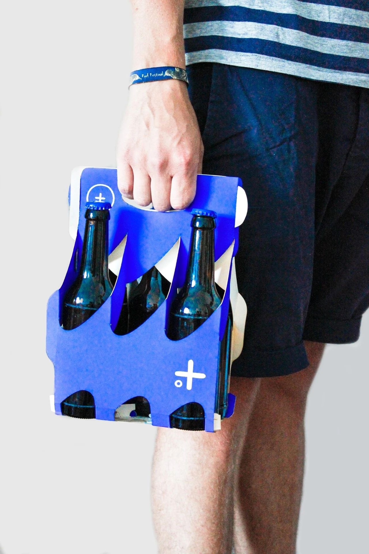
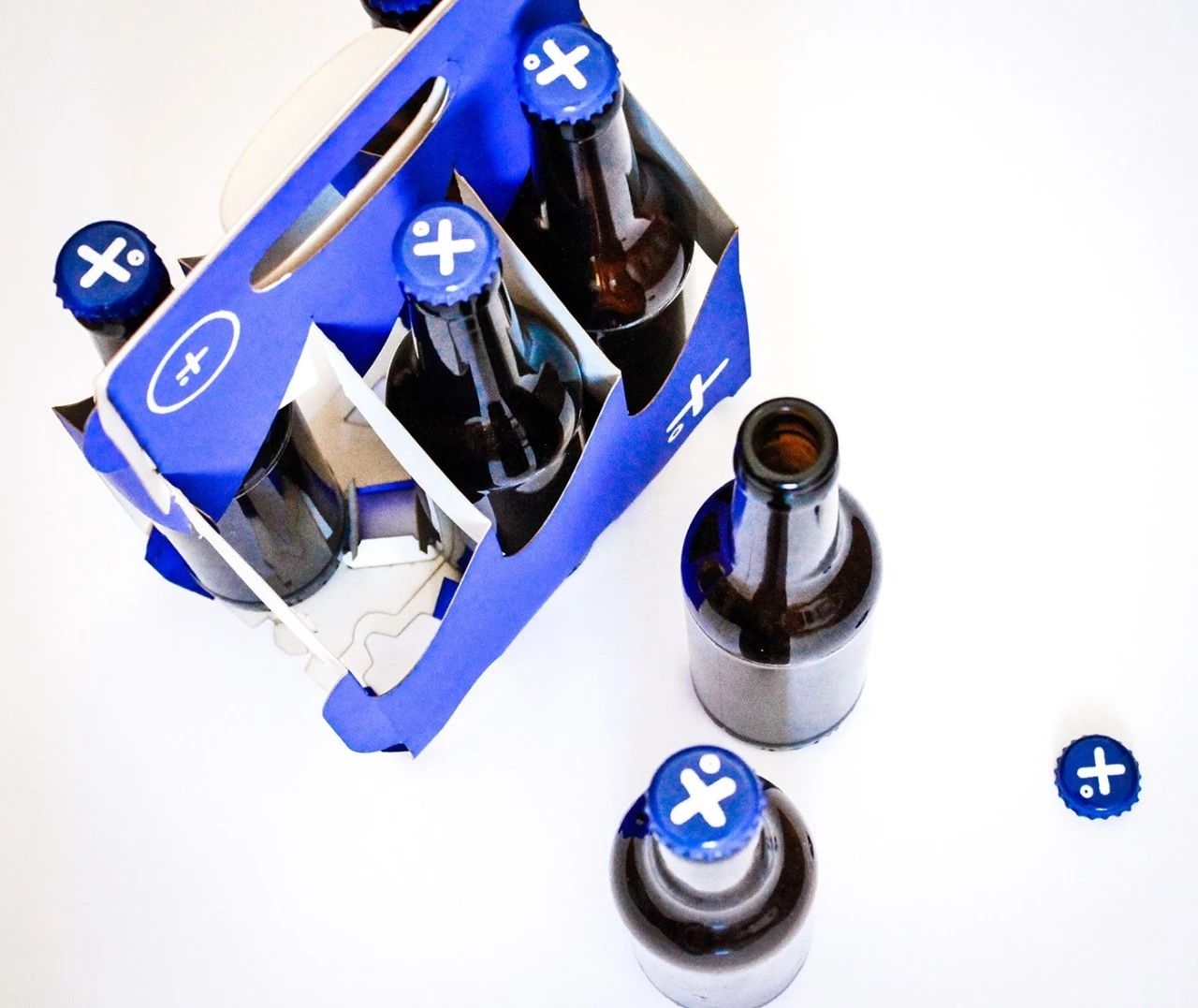
Less material, more usability.
The goal of the redesign was to create a sixpack carrier, that has a very high usability and is as eco-friendly in production and recycling as possible.
On one hand the packaging offers to the user a flexible handling of the single bottles without loosing any functional aspects of the packaging. On the other hand it is using the same amount of material as the common paper banderole packaging and resigns any glue, which lowers the material costs to a minimum and makes it easily recyclable.
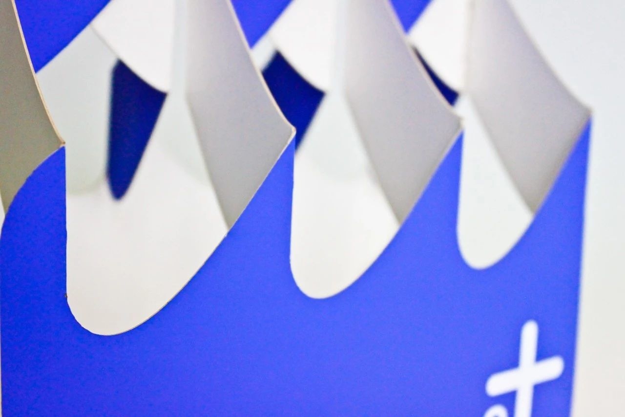
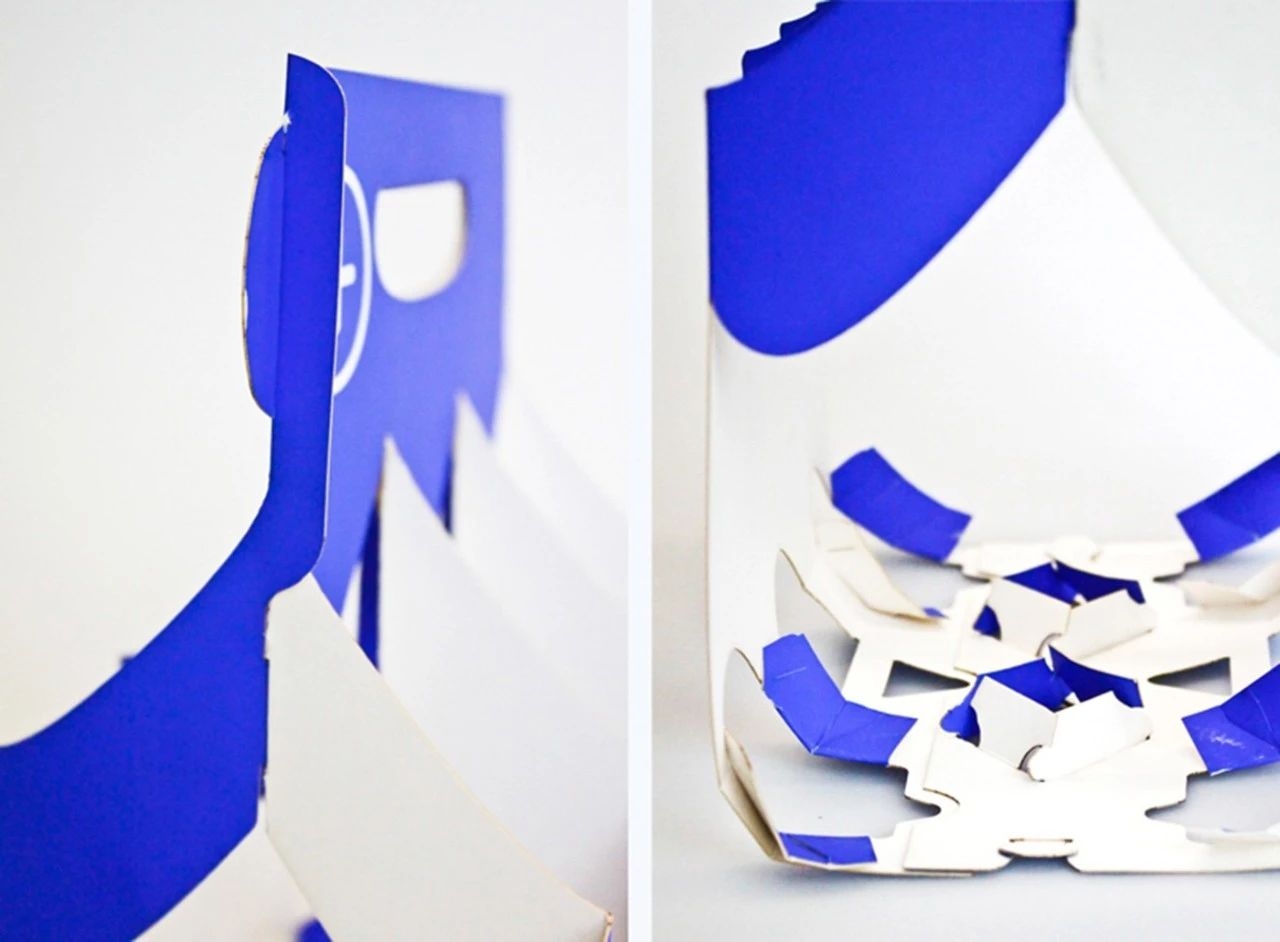
The round, wavy shape prevents the breaking of the paper in a specific point or angle. This creates the desired stability, despite the little amount of cardboard.
The two parts are linked at the bottom in a way that distributes the forces that derive from the weight of the bottles. The shape of the bottom and the outer dimensions of the packaging arise from the shape of the beer crates, where the sixpack carriers are carried in from the production to the selling point.
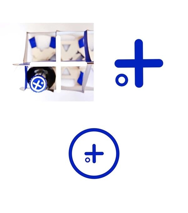
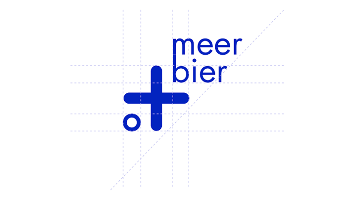
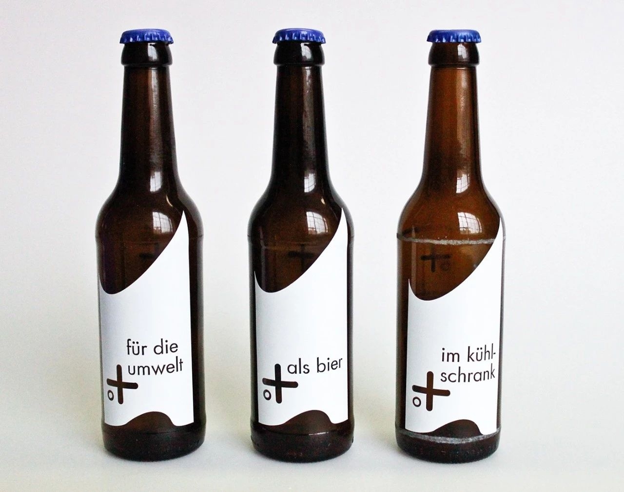
The waves are also giving the product its name „meerbier“, whose sound has two meanings in german, „beer of the sea“ and „more beer“. The name communicates a positive feeling of summer and at the same time calls the users attention to the additional advantages, by offering „more“ to him and our environment.
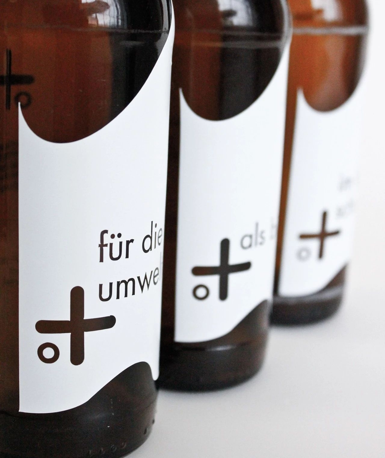
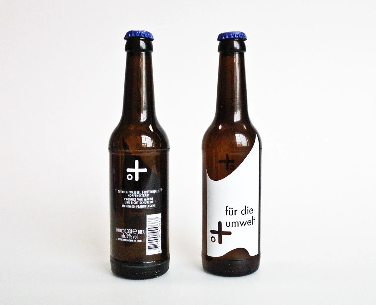
The plus as a logo increases this image.
The bottledesign also plays with the double meaning of the brandname. Some slogans represent the characteristics and the mood of the package and the beer. The plus stands in lieu of the name "sea" but also for "more". The added frases complete the slogan into statements like "sea/more .. for the environment" or "sea/more .. in your fridge".
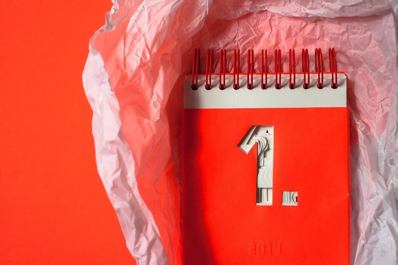
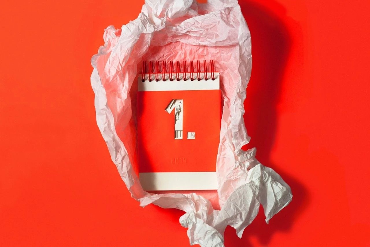
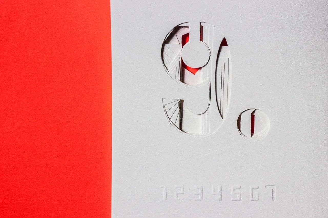
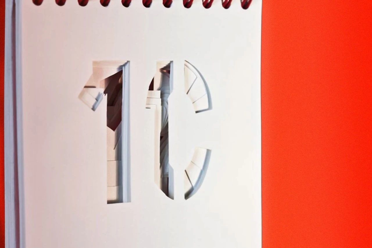
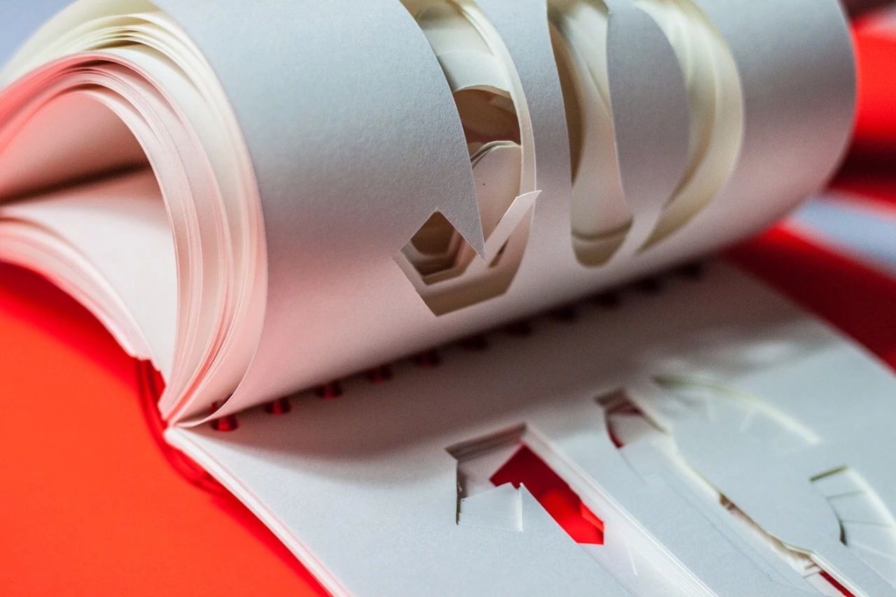
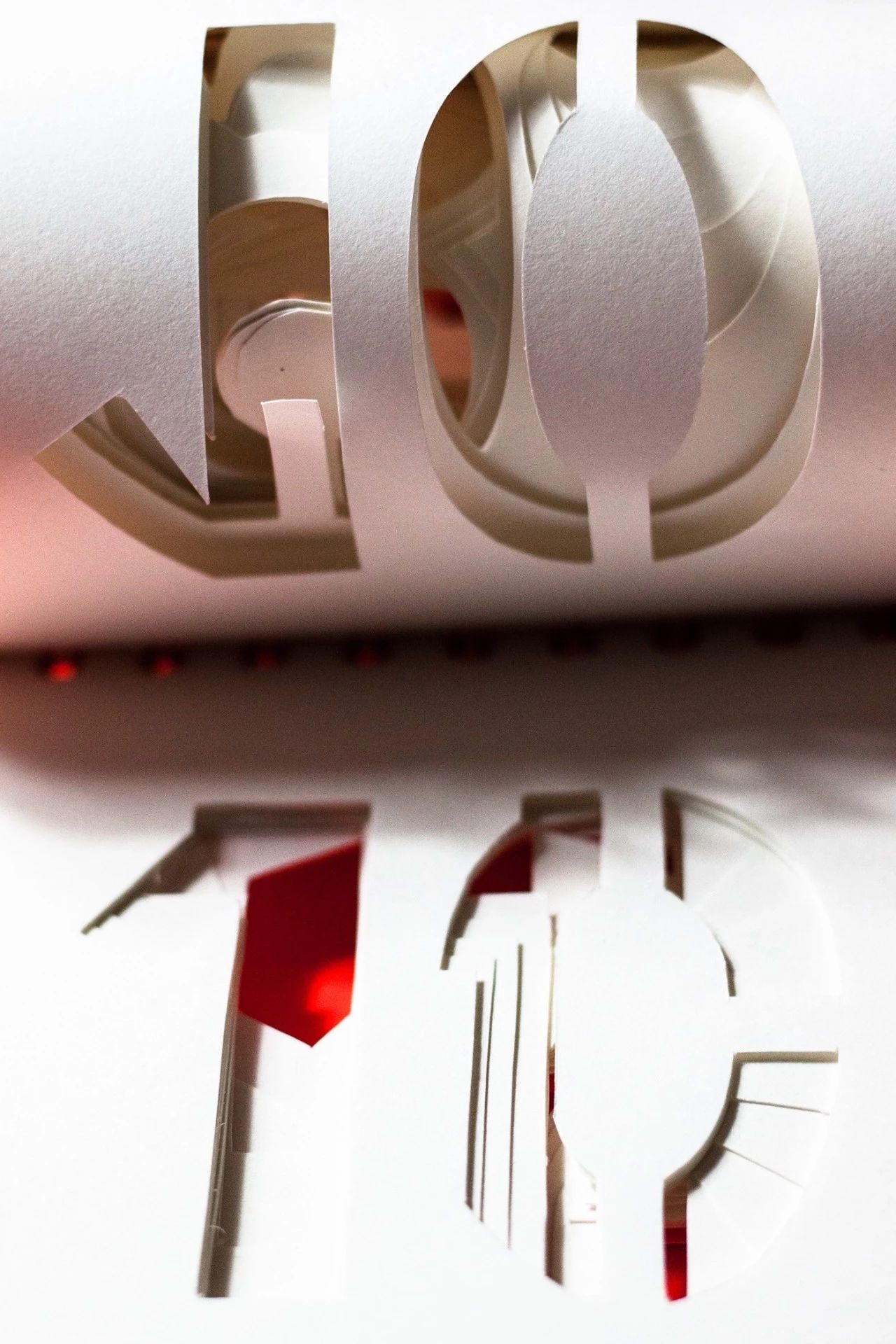
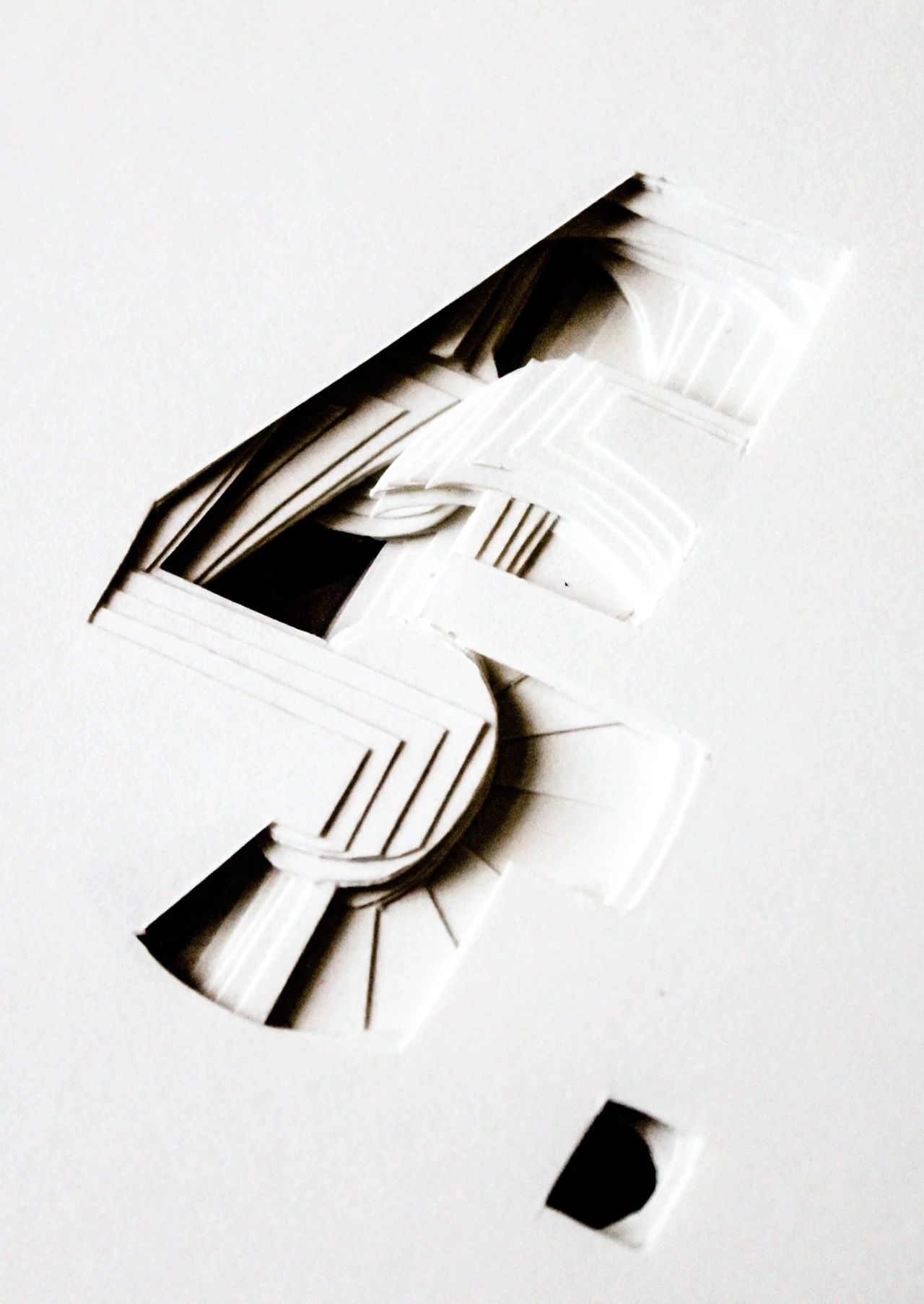
Morphing Calendar
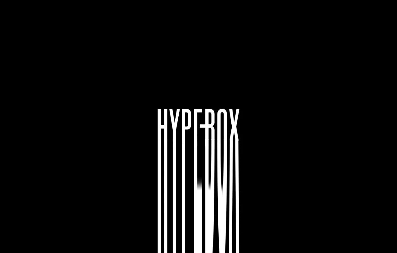
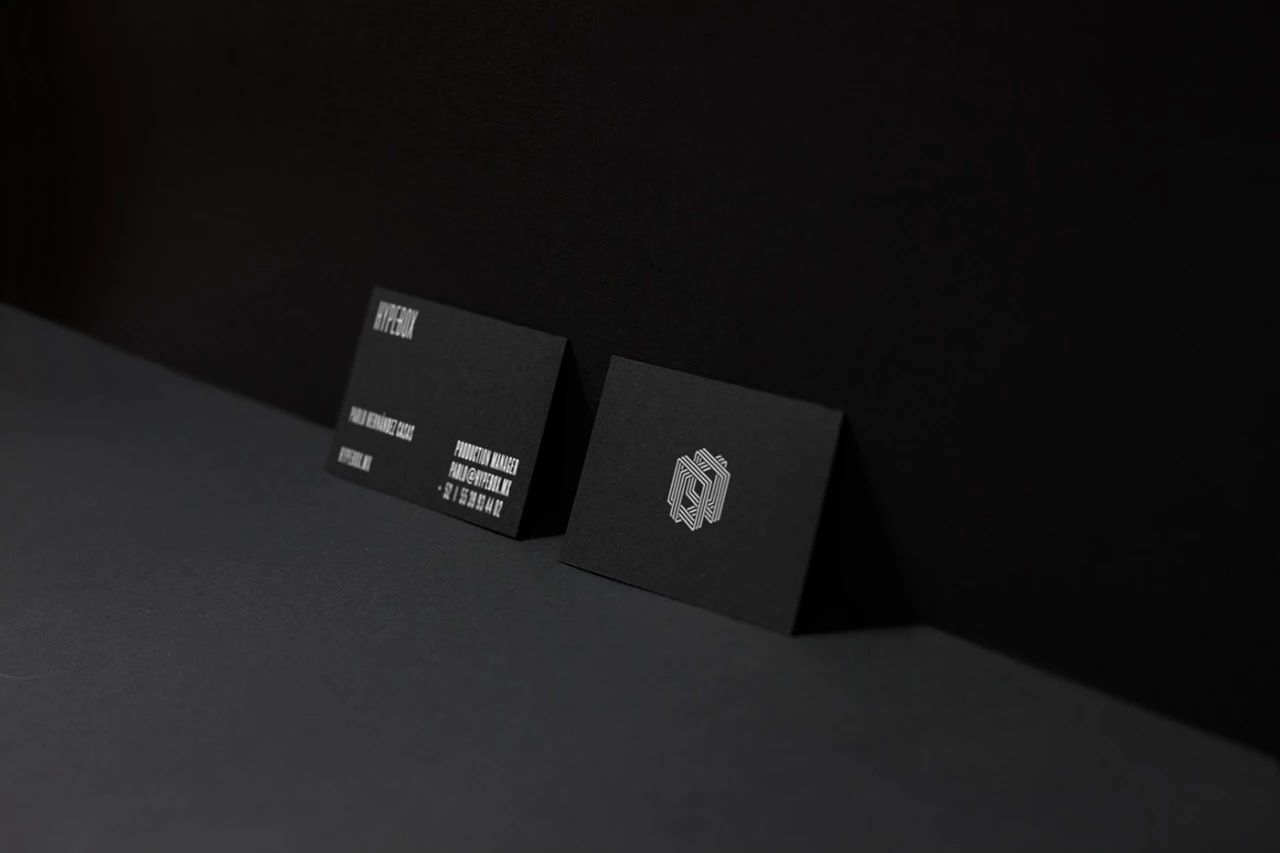
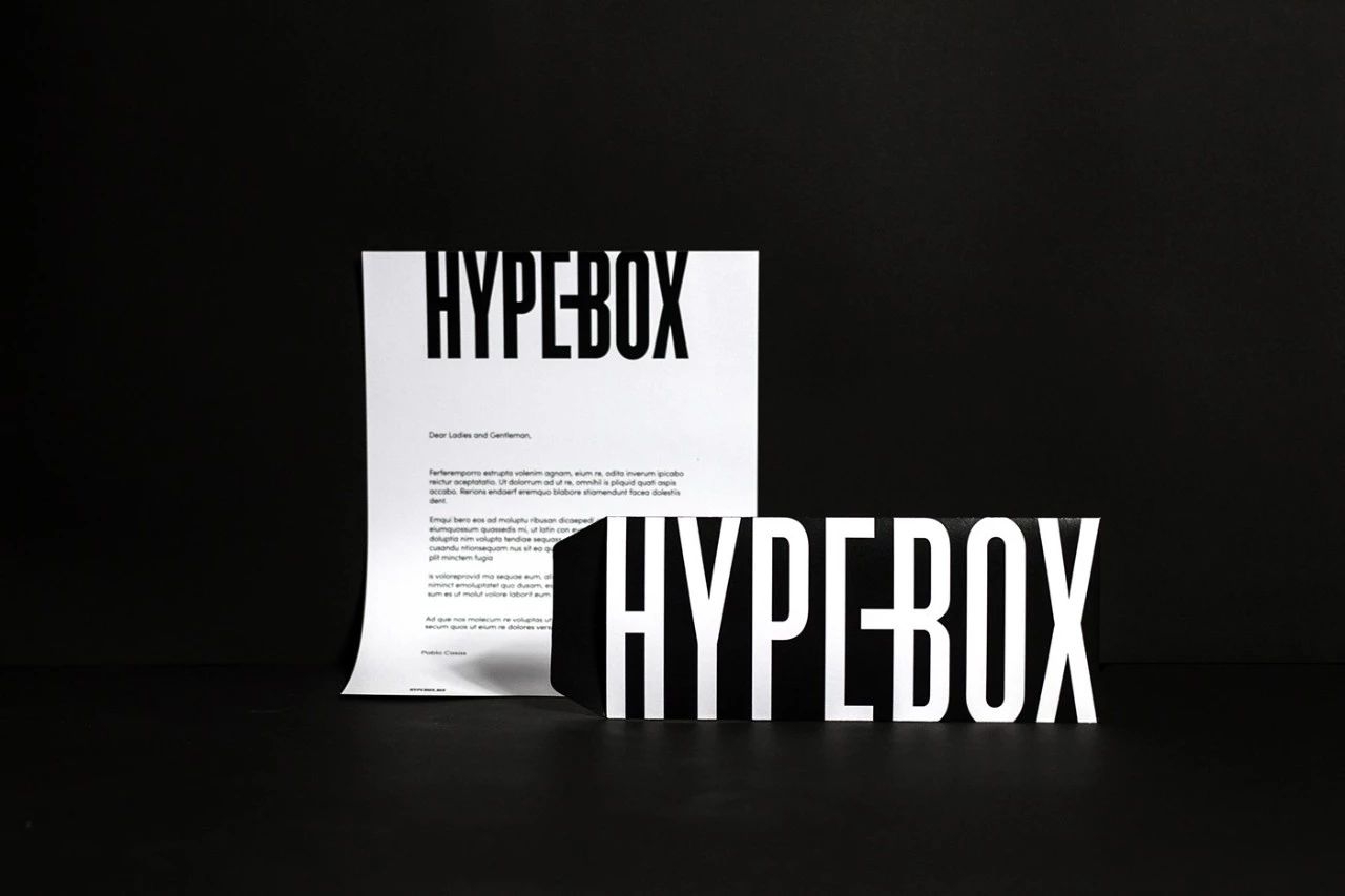
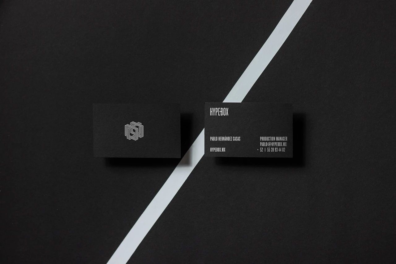
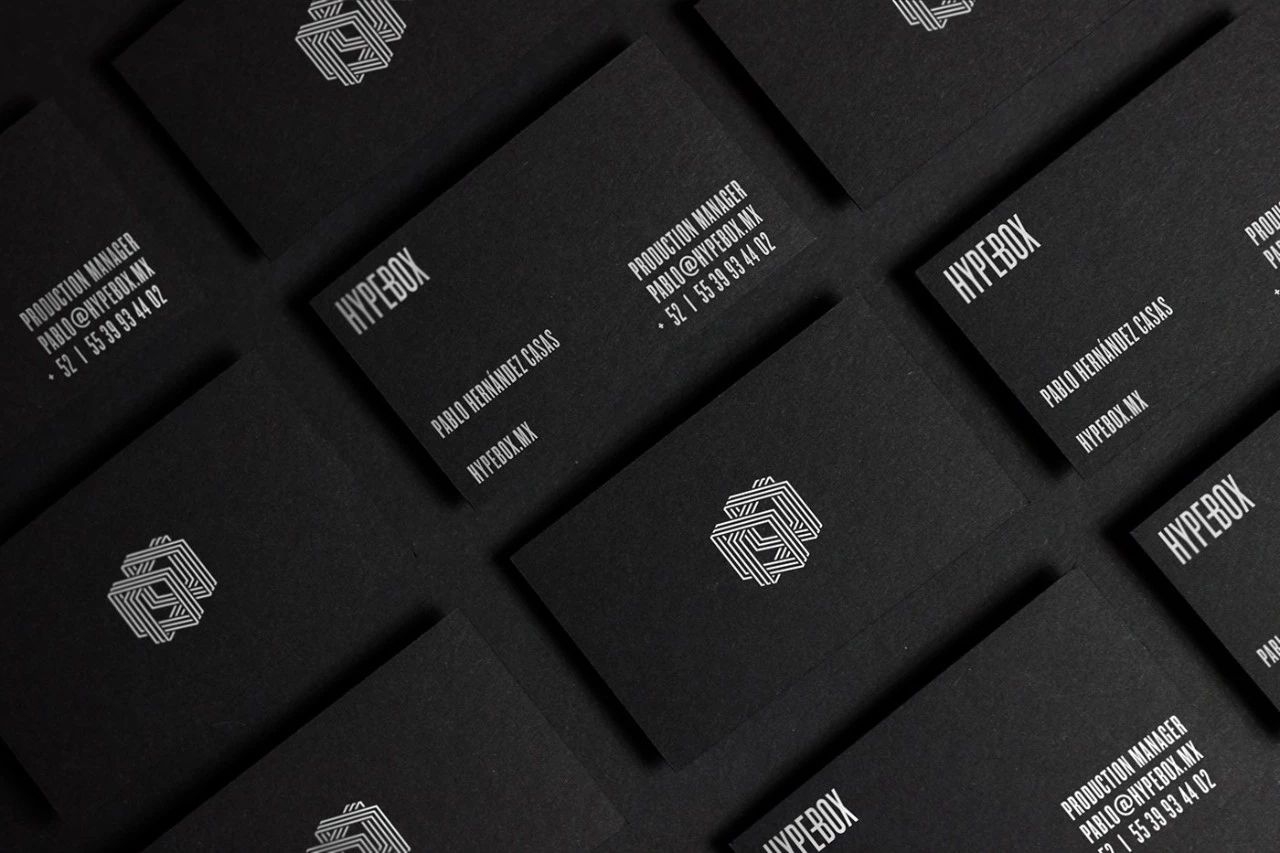
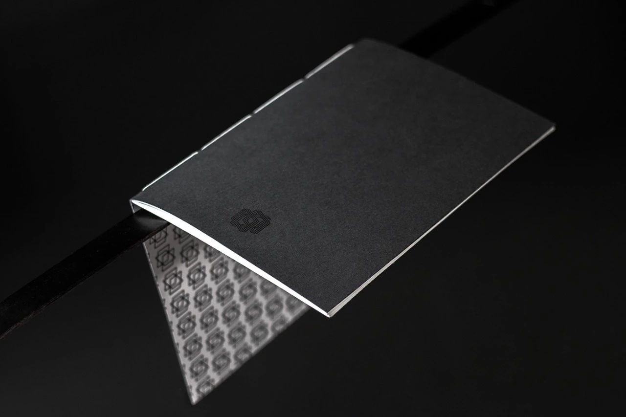
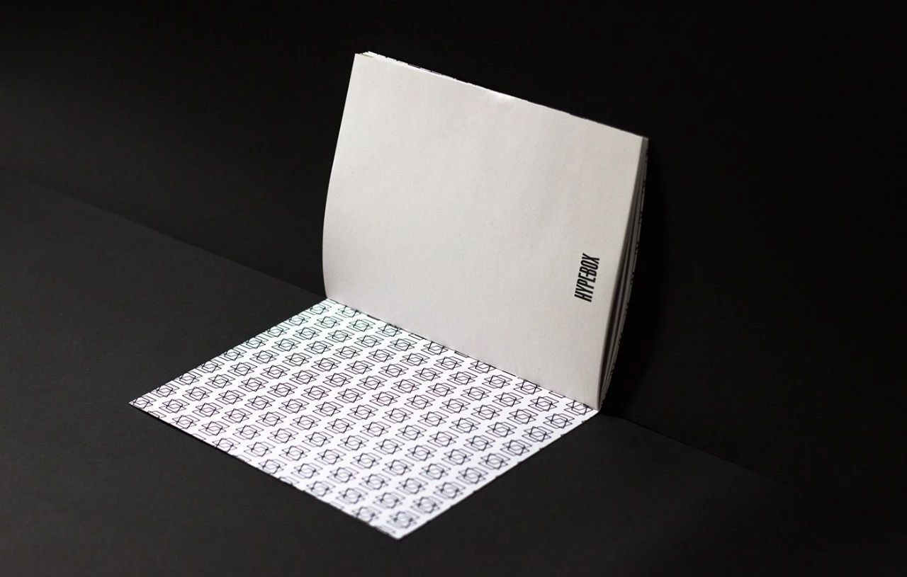
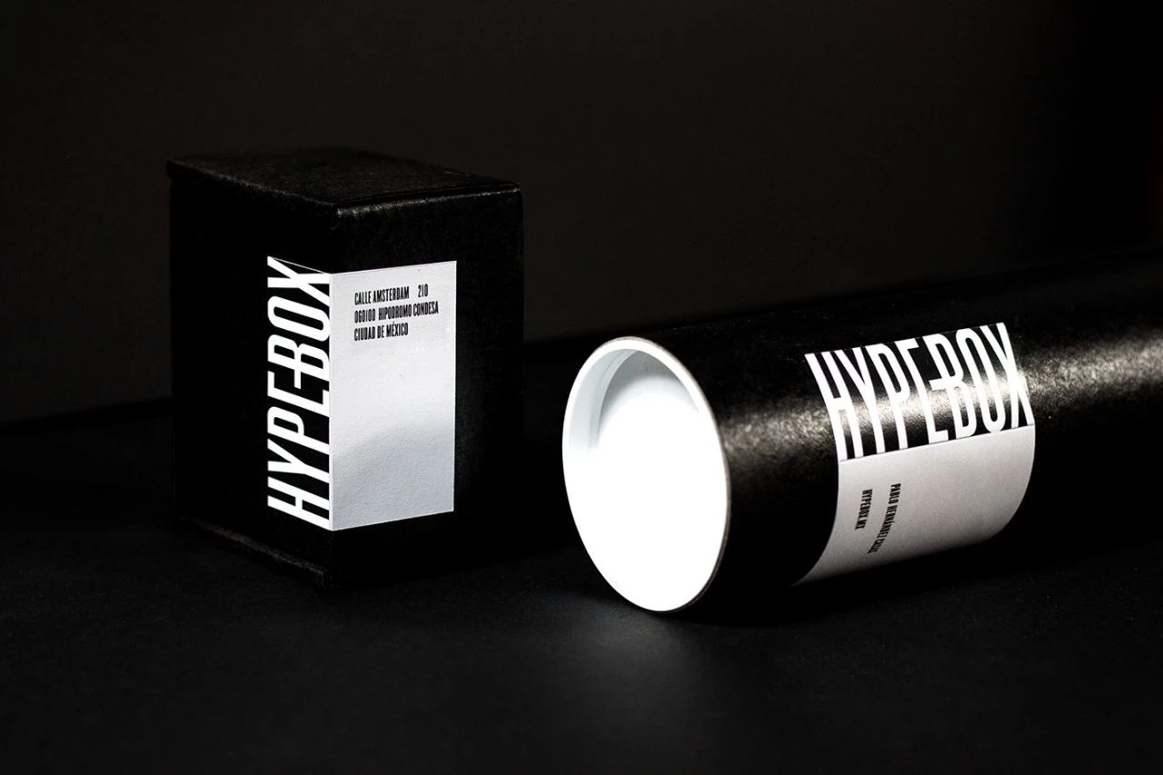
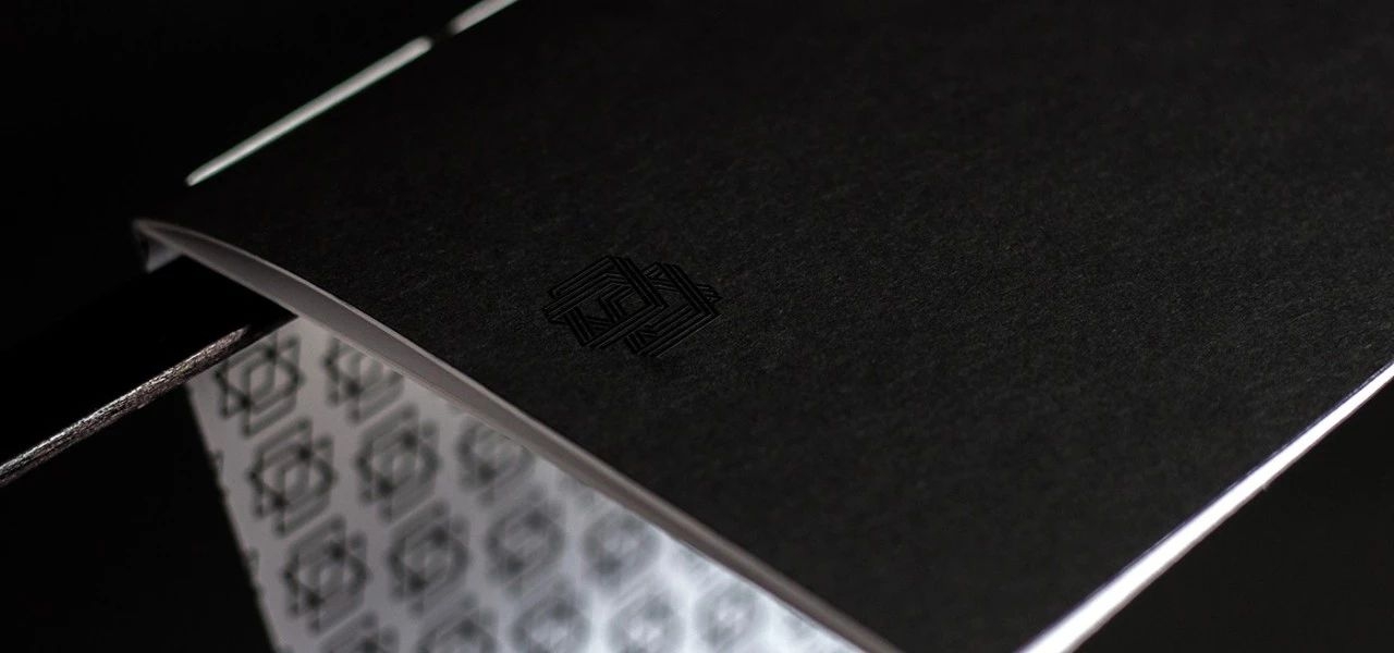
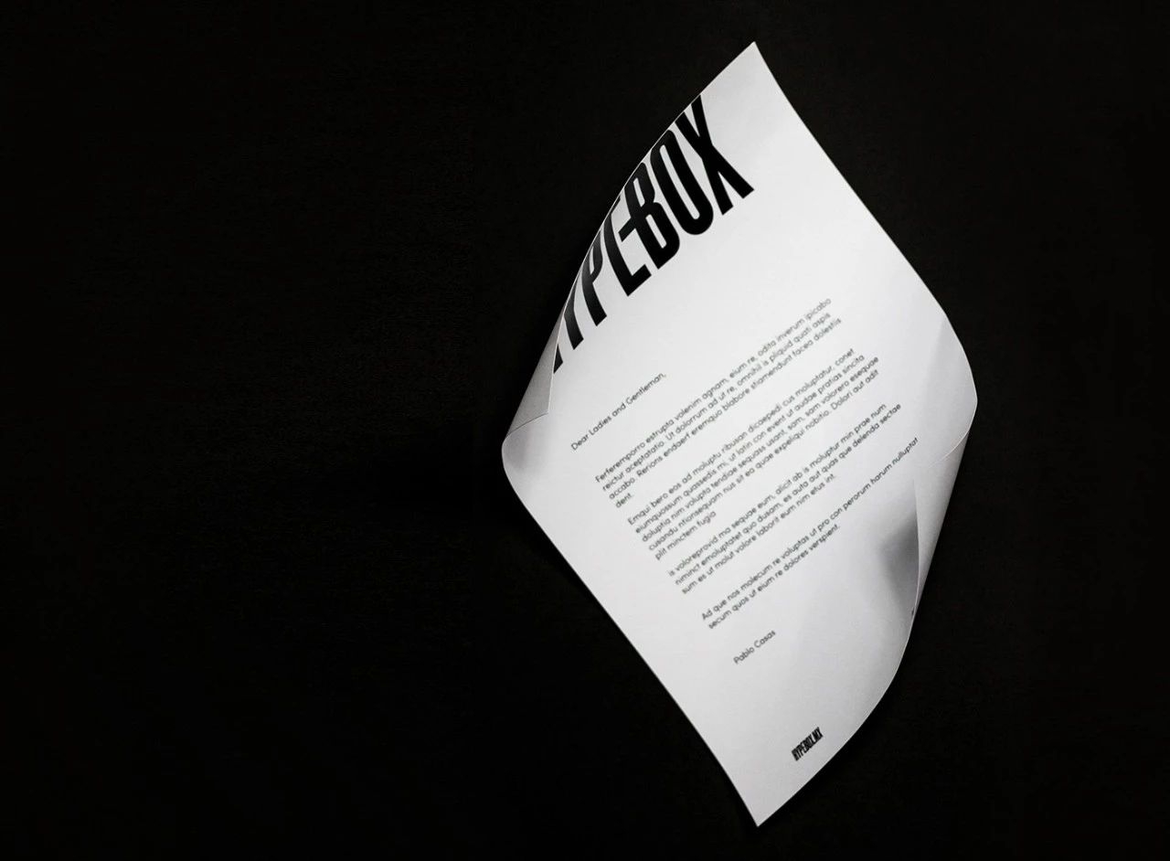
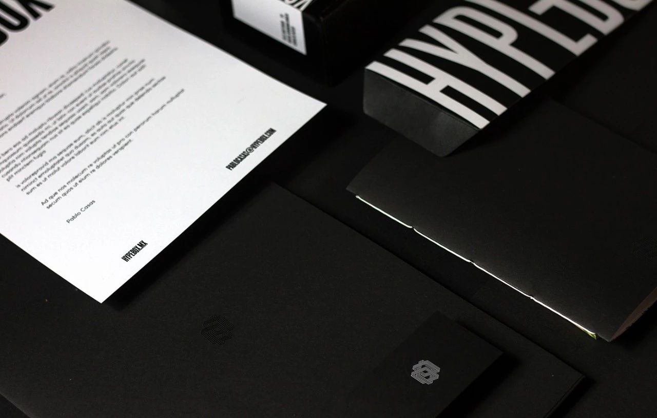
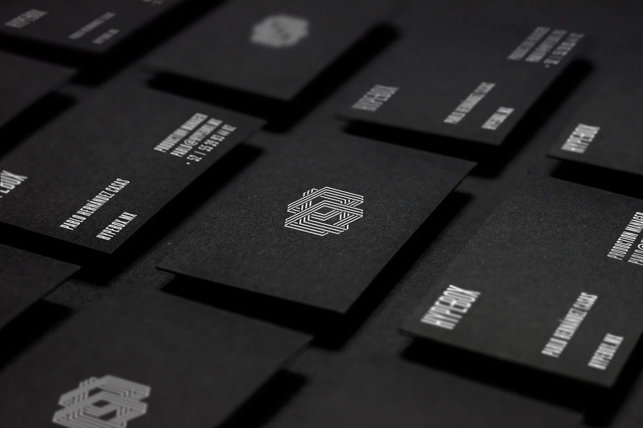
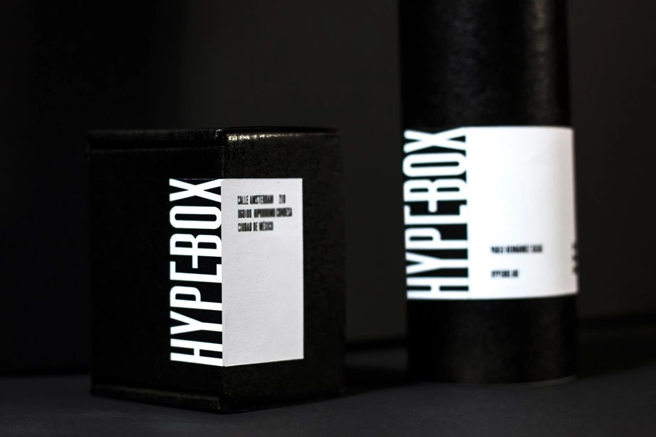
HYPEBOX
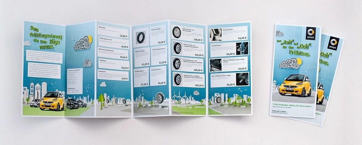
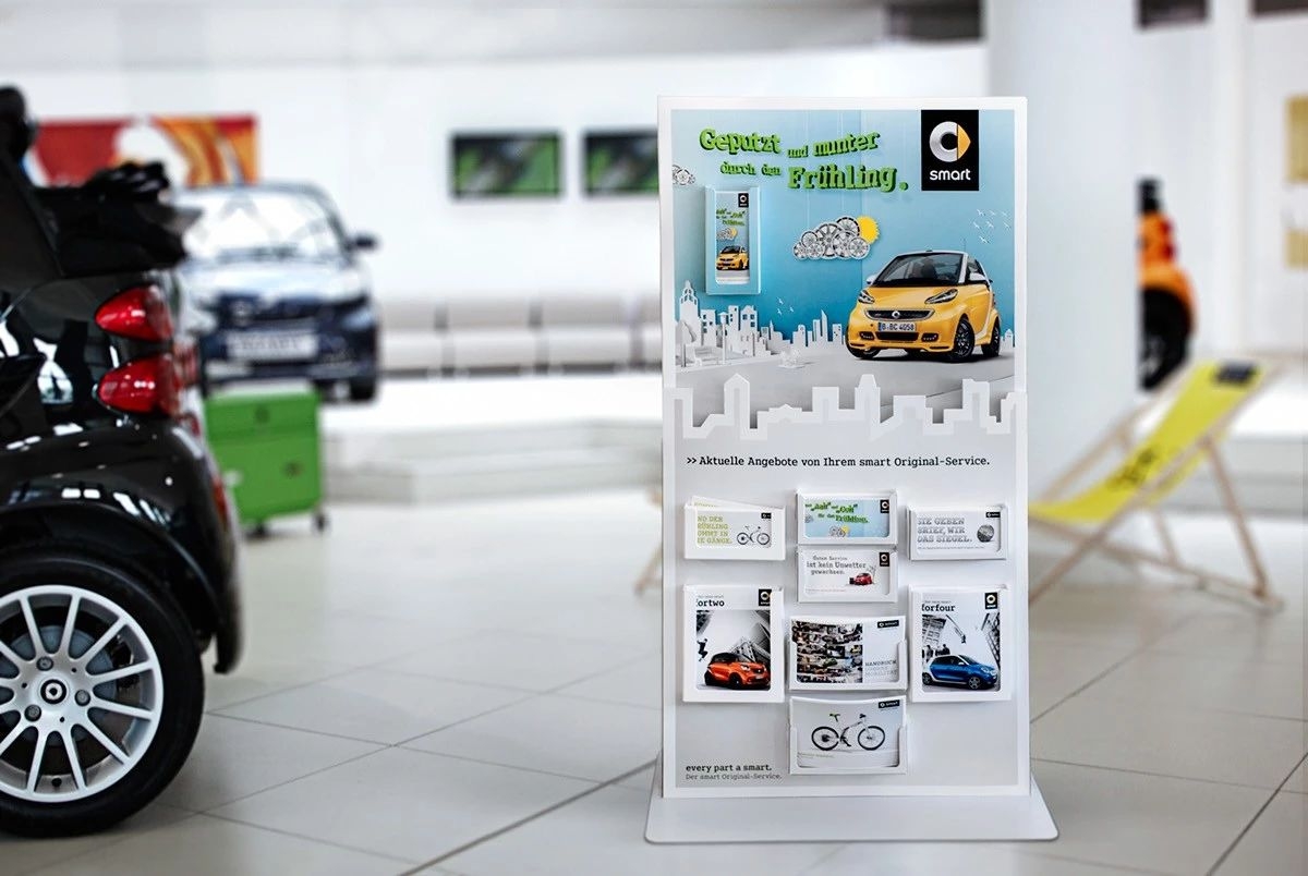
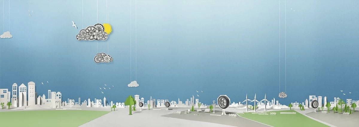
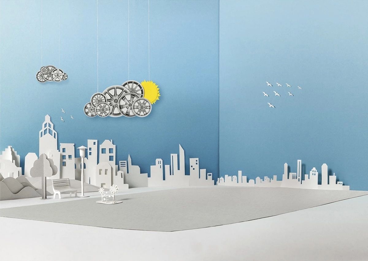
smart - spring campaign 2015
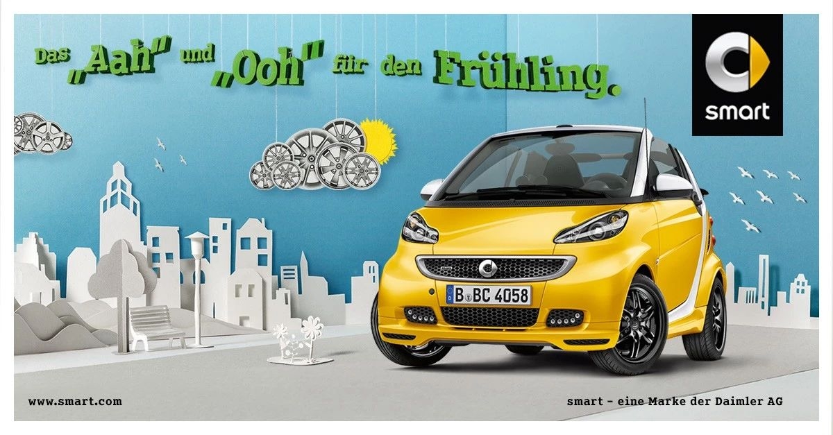
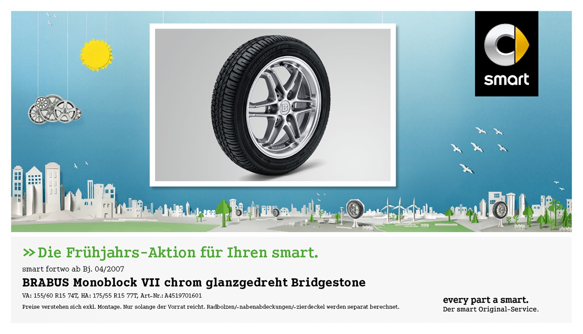
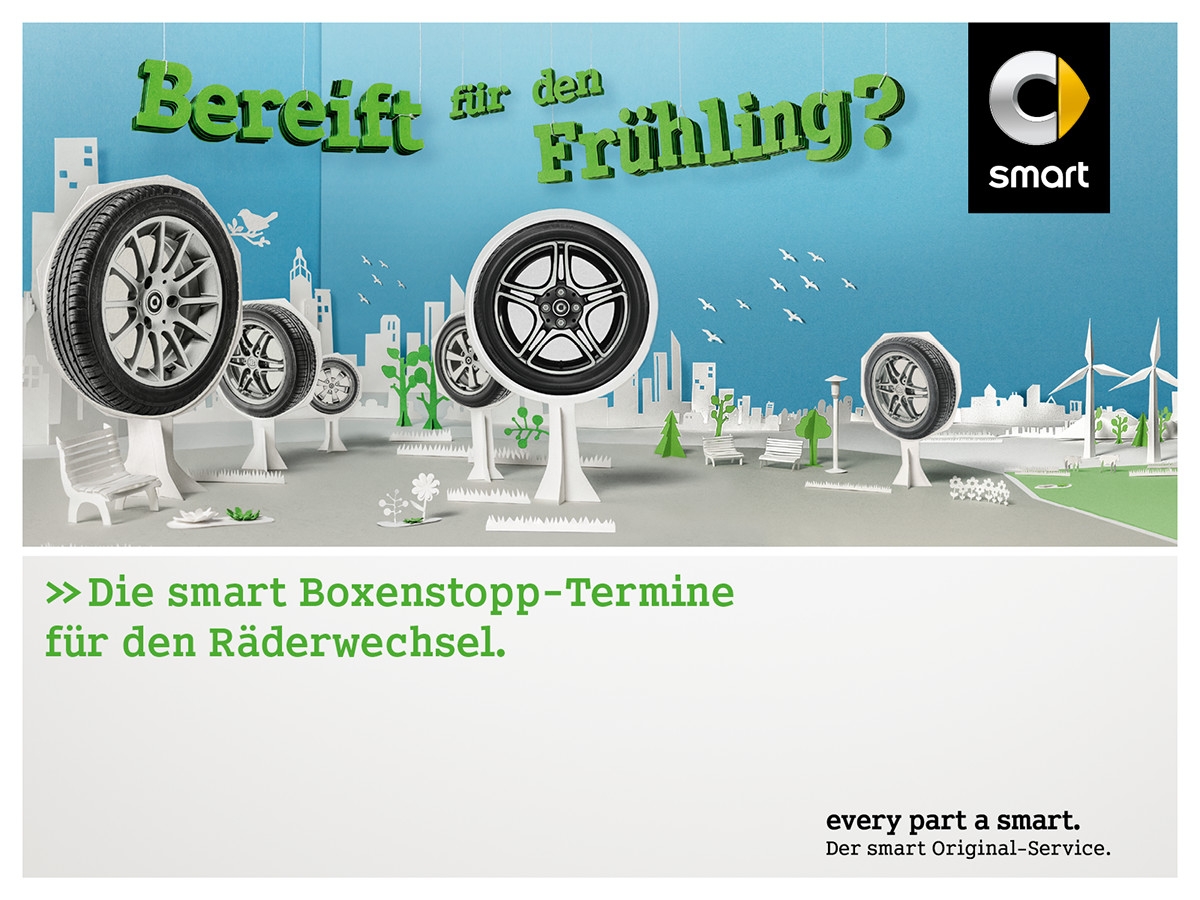

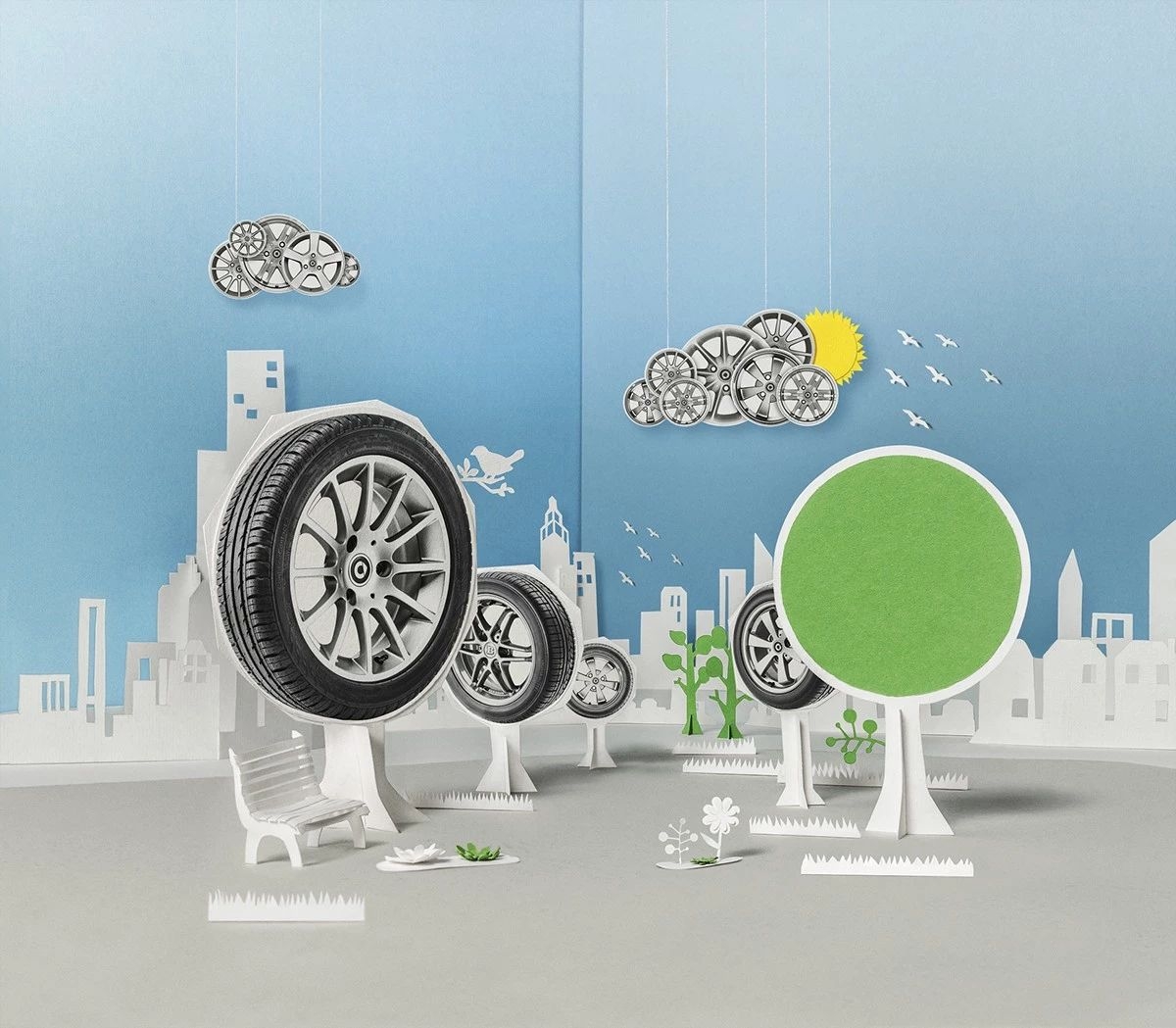
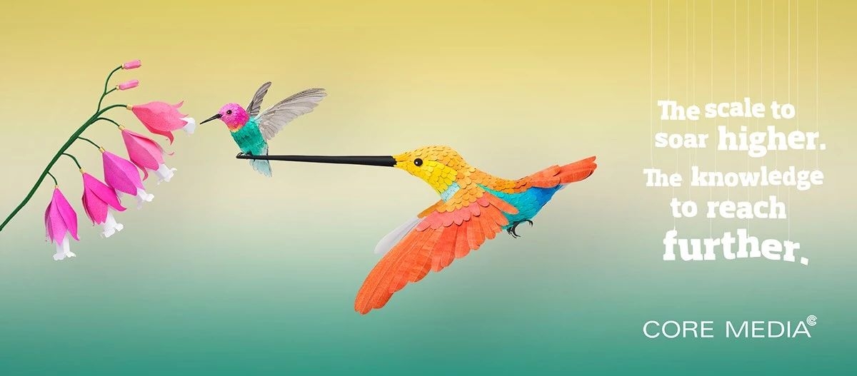
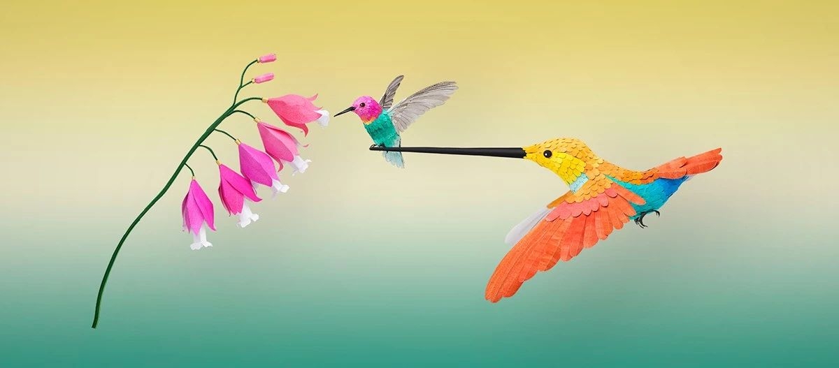
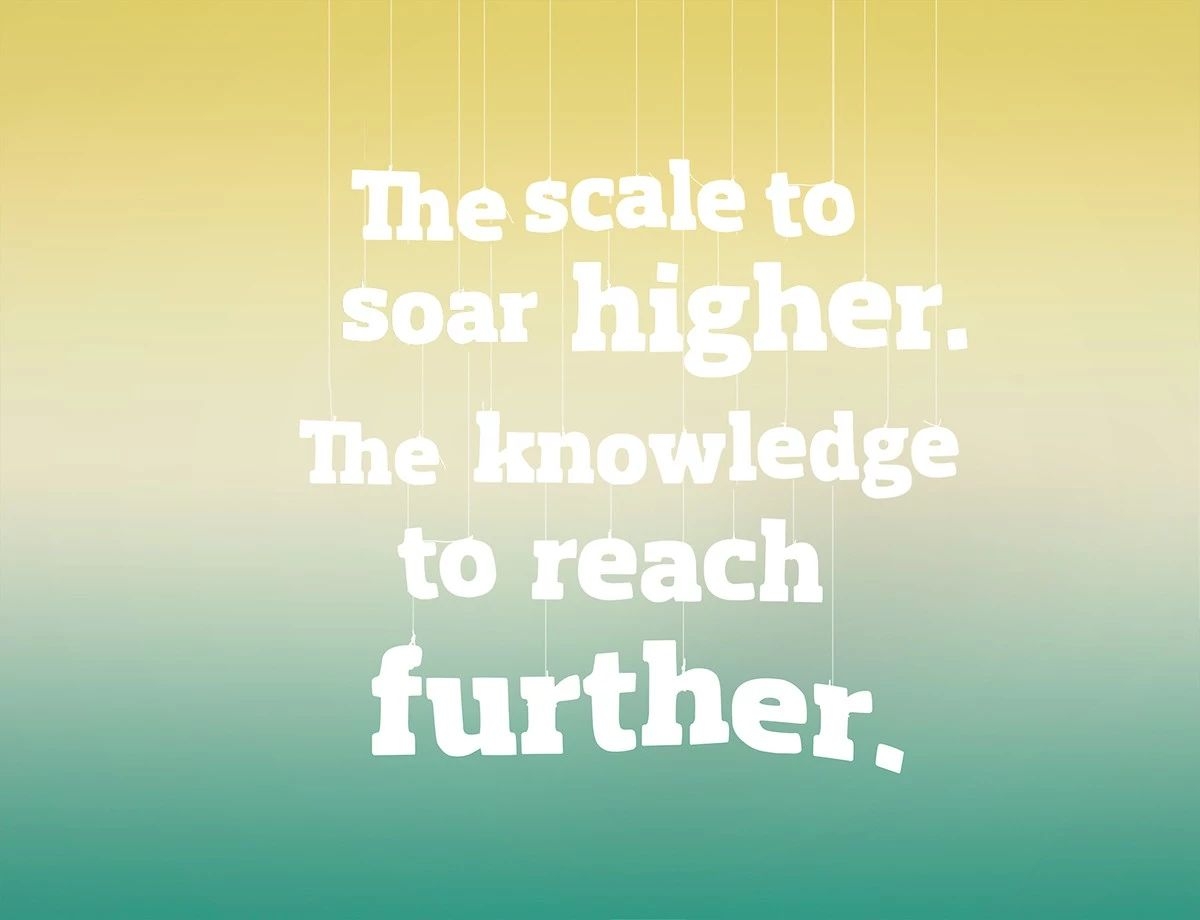
CORE MEDIA / Publicis Dublin - Print
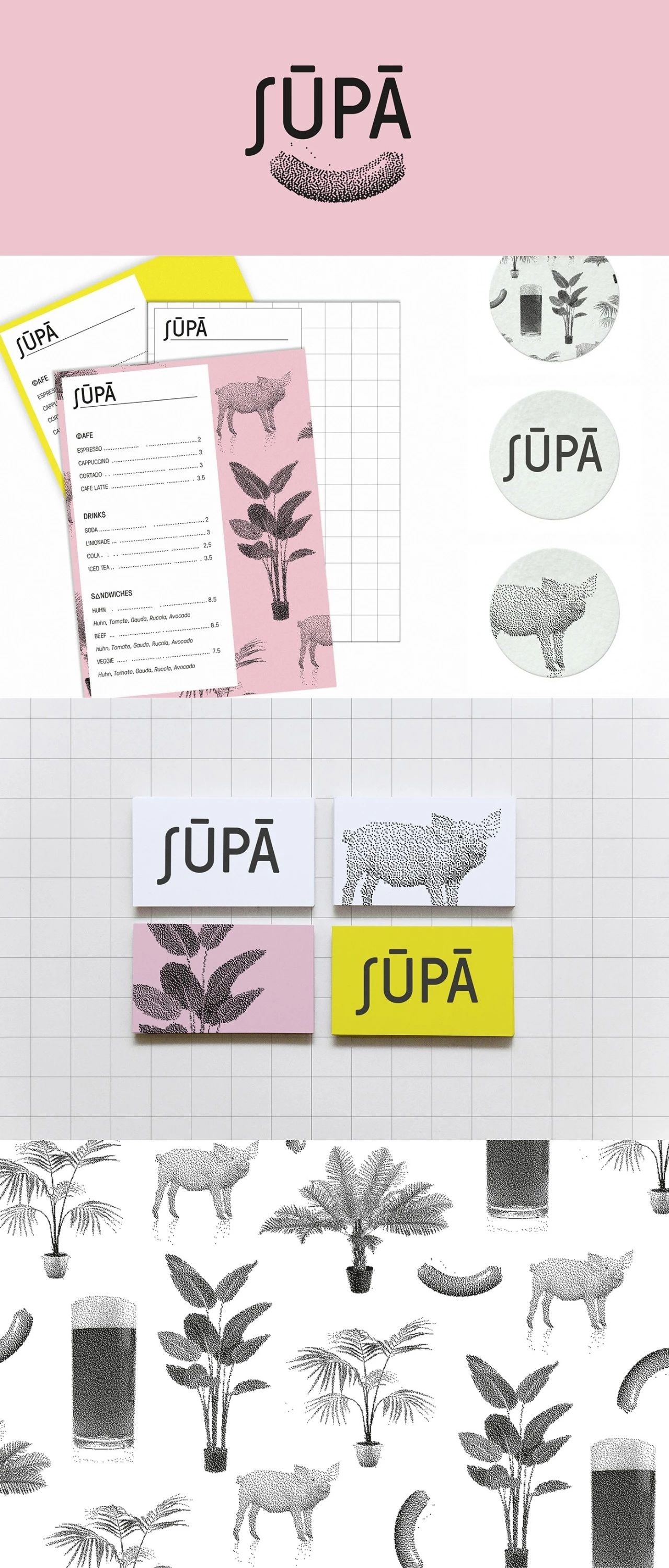
Identity and interior concept for a café and bar
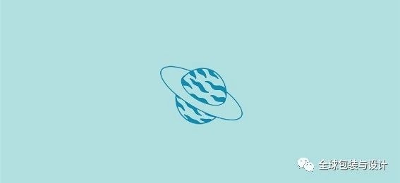
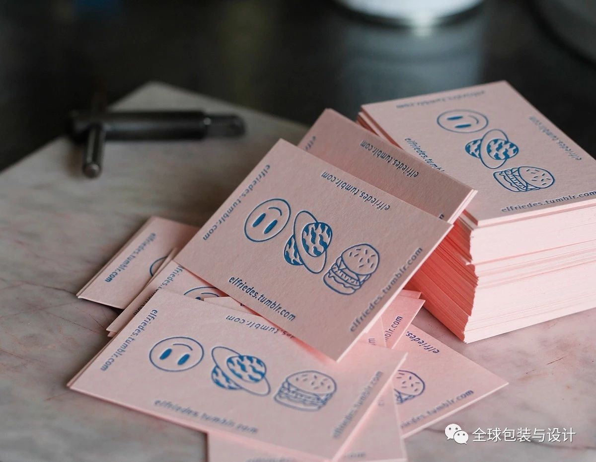
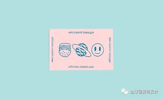
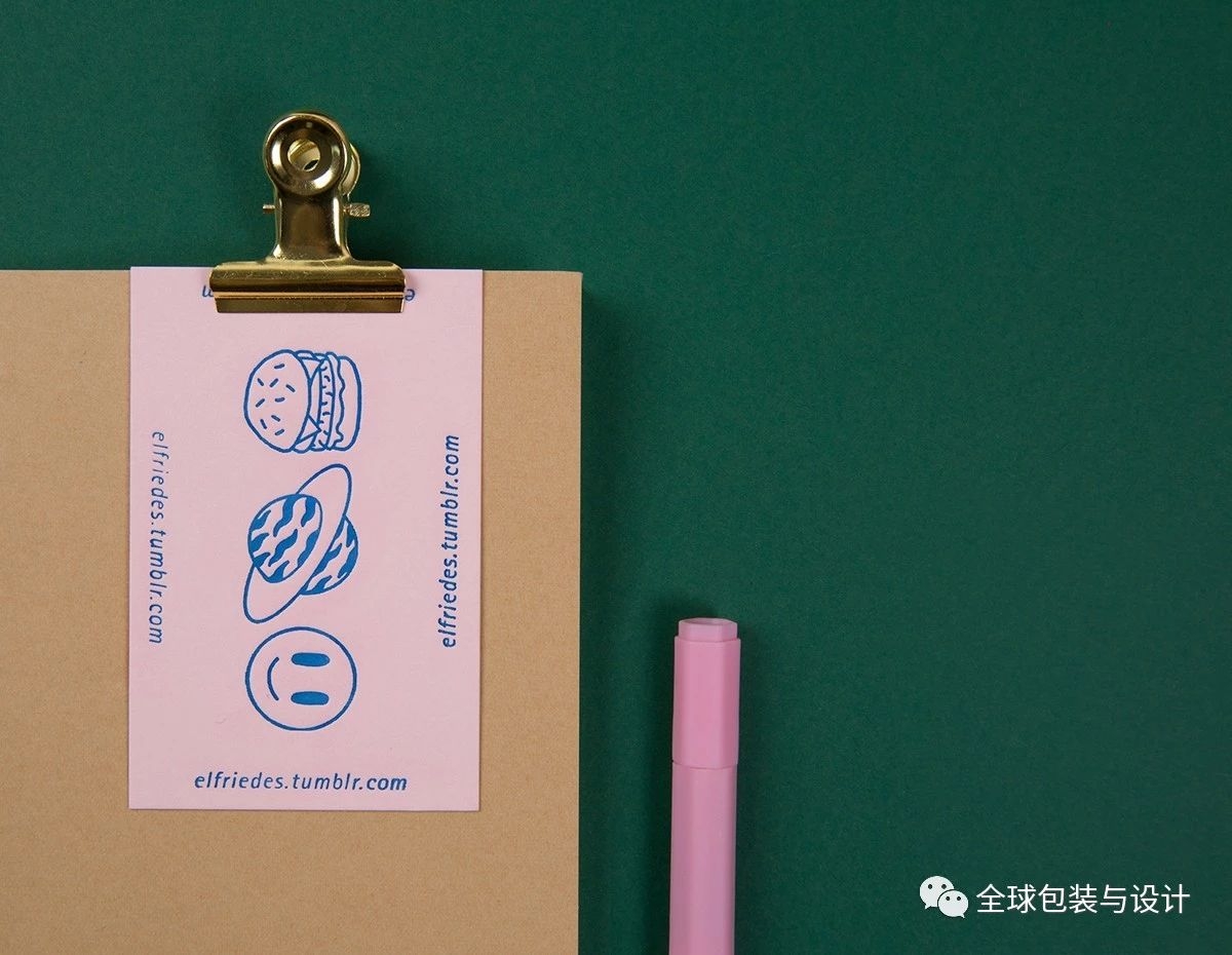
Letterpress cards
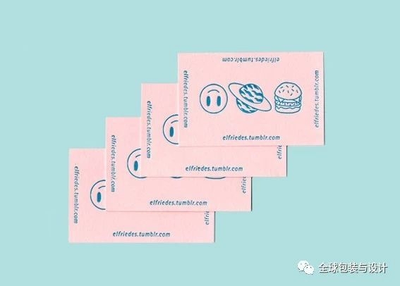
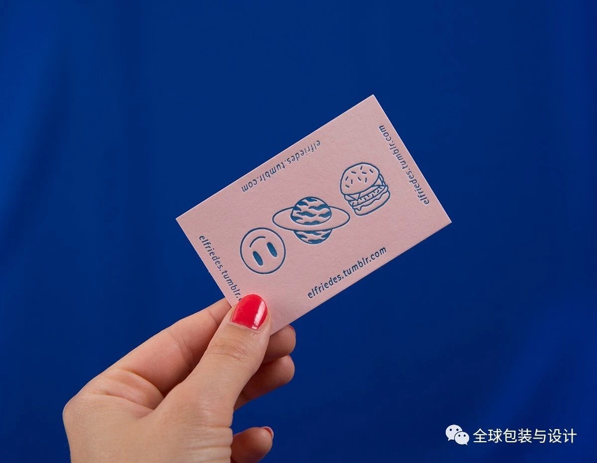
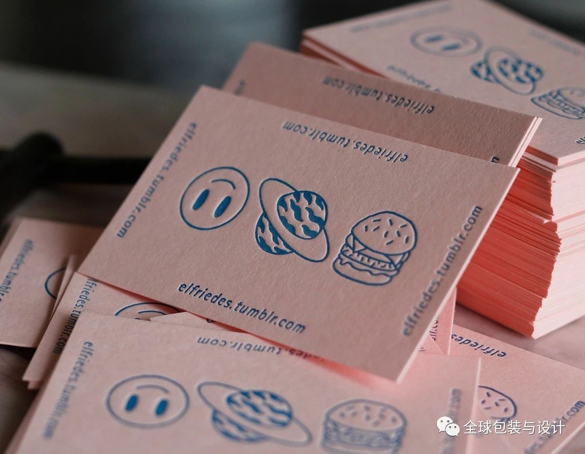
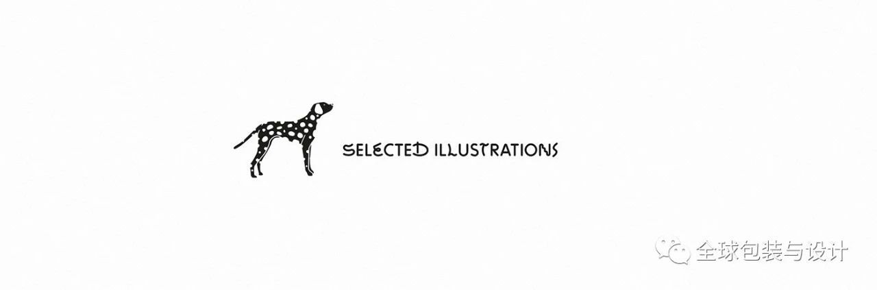
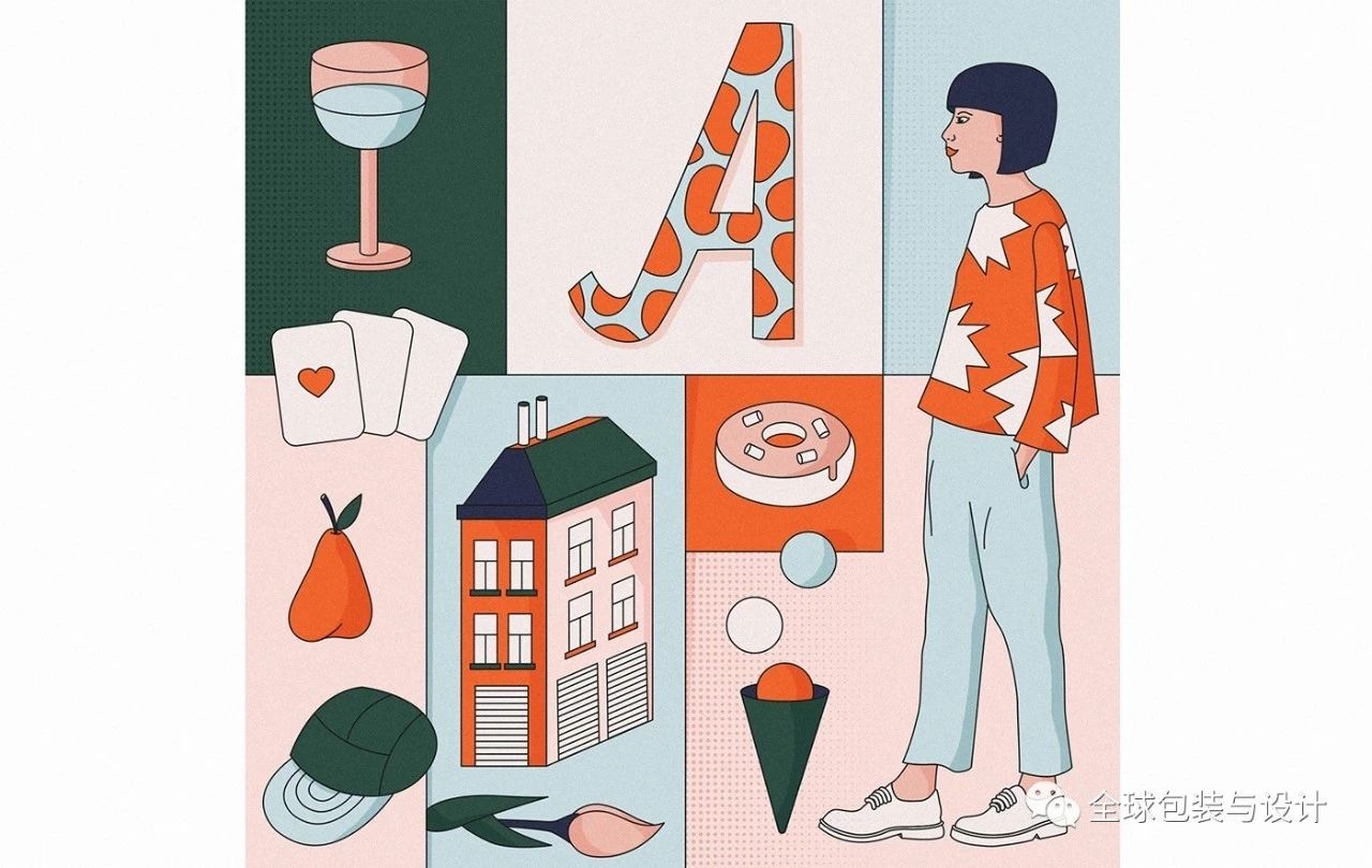
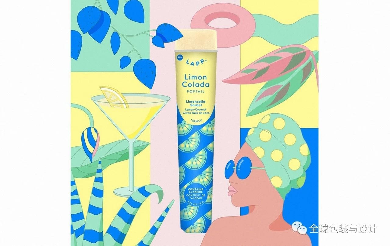
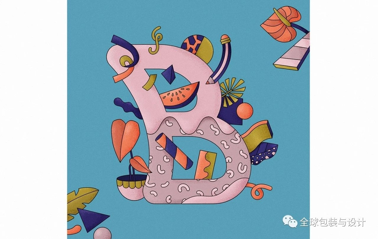
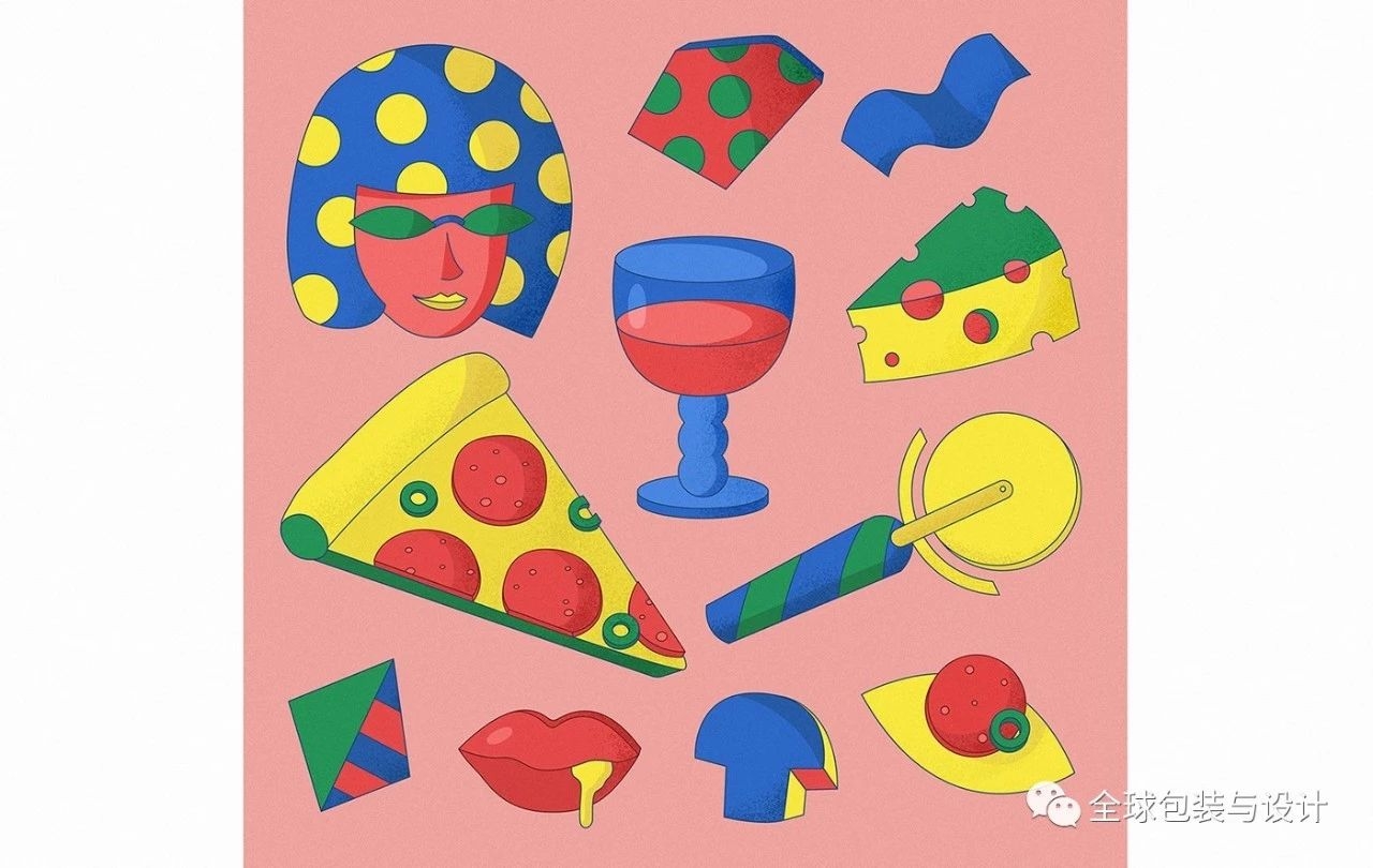
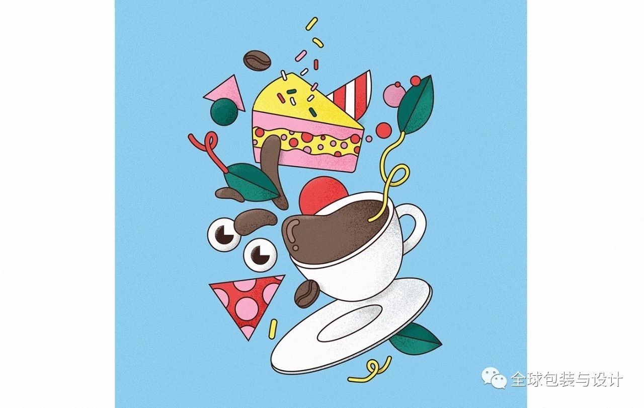
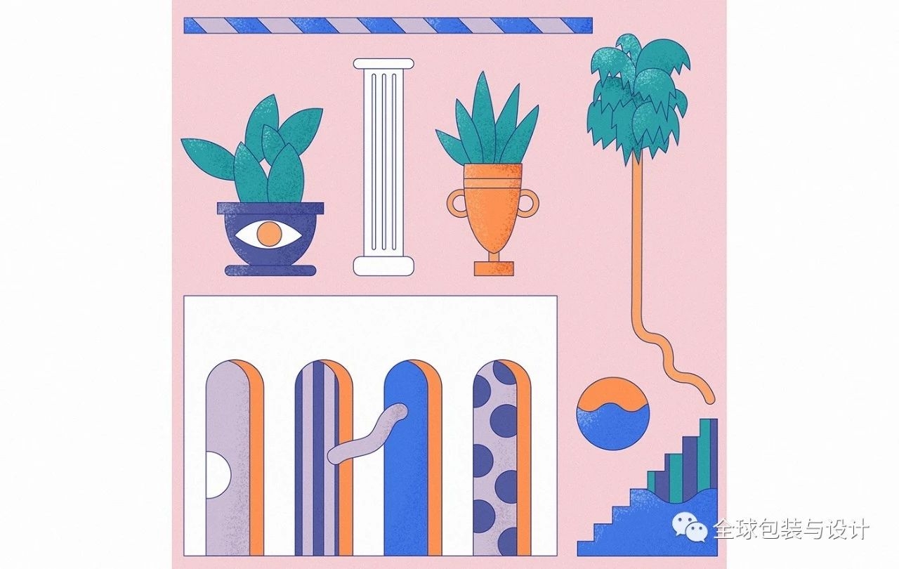
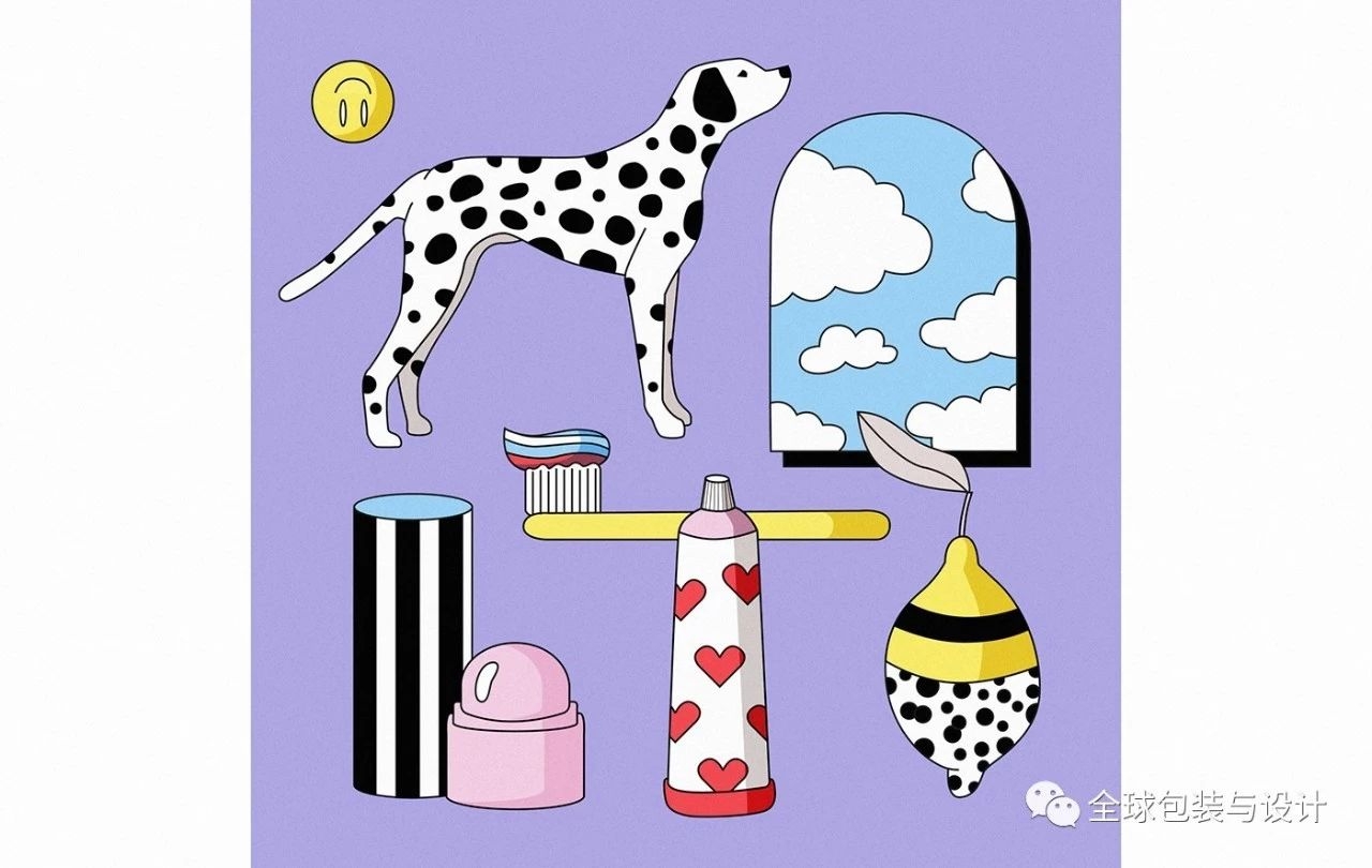
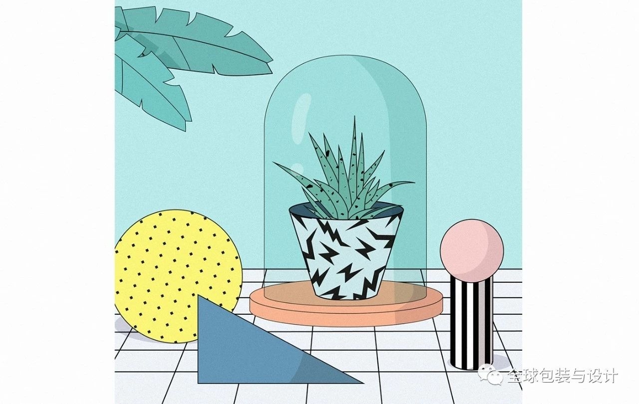
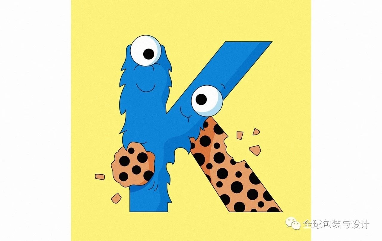
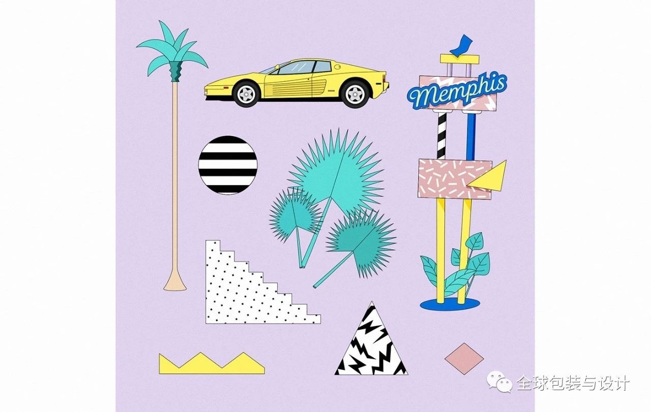
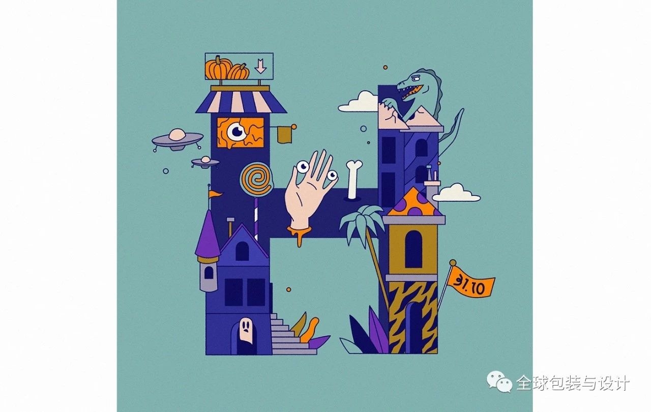
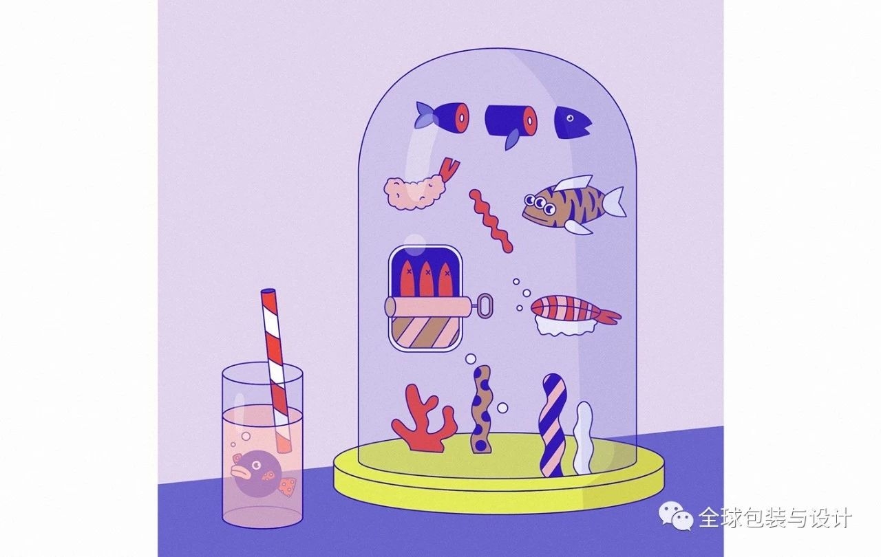
Selected illustrations
END
关注厚启,学习更多品牌打造方法
免责声明:我们尊重原创,本平台所载图文等稿件均出于为公众传播公益目的,
本文中的图片仅用于分享学习,禁止企业或个人商用,如涉及版权问题,请联系我们删除。
增长从厚启开始
帮助企业建立品牌,让企业少走弯路,积累品牌资产,减少推广费用
厚启品牌营销咨询是一家专注
品牌全案策划、品牌定位、品牌命名、
slogan创作、卖点提炼、商标设计、包装设计
的营销策划与品牌设计服务公司。
我们站在消费者的角度,深入了解客户的企业战略,
创造出具有商业价值的品牌营销和设计解决方案。
一企一策 合作咨询
 找老板谈:
找老板谈:
180 9296 1937
(马路)
关注创始人视频号, 观看更多品牌故事:

本网站工作成果图片及资料均为厚启公司版权所有,
对于任何形式的侵权行为,
我们将保留一切追究法律责任的权利。
©2015-2020 陕西厚启品牌设计有限公司 西安专业的包装设计公司
 陕公网安备 61011102000379号
其他地区域包装设计:上海包装设计、北京设计公司、北京包装设计、
广州包装设计、东莞包装设计、济南包装设计、西安设计公司
广州包装设计、东莞包装设计、济南包装设计、西安设计公司